Moody's Data Visualization Guidelines
A data visualization design system that complements and elevates Moody's brand.
Impact
Since the launch, this design system has become an invaluable asset for design teams across the organization. The most prominent use case for the system has been for their editorial data visualizations throughout their strategic communications on moodys.com and social media channels. Their LinkedIn presence and online engagement has increased, with data visualizations becoming a key driver.
Context
To support Moody's expansion and refreshed brand identity, Moody's brought on a specialized partner to help translate its new visual identity and voice principles into data visualization design standards. As a freelance Data Visualization Designer on this project, I had the opportunity to assist the lead designer in tackling a real organizational challenge — multiple teams were producing charts without a unified approach, resulting in inconsistent visual outputs across the company.
The audit
I conducted a comprehensive audit of 270+ charts across Moody's analytics teams to uncover pain points and opportunities within Moody's data visual storytelling ecosystem.
Four recurring pain points across the organization:
Inconsistent color usage across teams
Misapplied chart types that obscured rather than clarified complex data
Absence of hierarchy and labeling standards
Accessibility gaps that limited the reach of Moody's visual storytelling

Explorations
With the audit insights as our foundation, the creative director and I moved into visual exploration, iterating on chart styles across the most prevalent types in Moody's portfolio.
We started by studying the new identity, from structure, hierarchy, color, typography, to voice, to find the clearest opportunities to weave the new brand identity into every dimension of the visual language.

We tested chart ideas with every aspect of the new Moody's visual brand, from colors, typography, patterns, to photography.

What we delivered
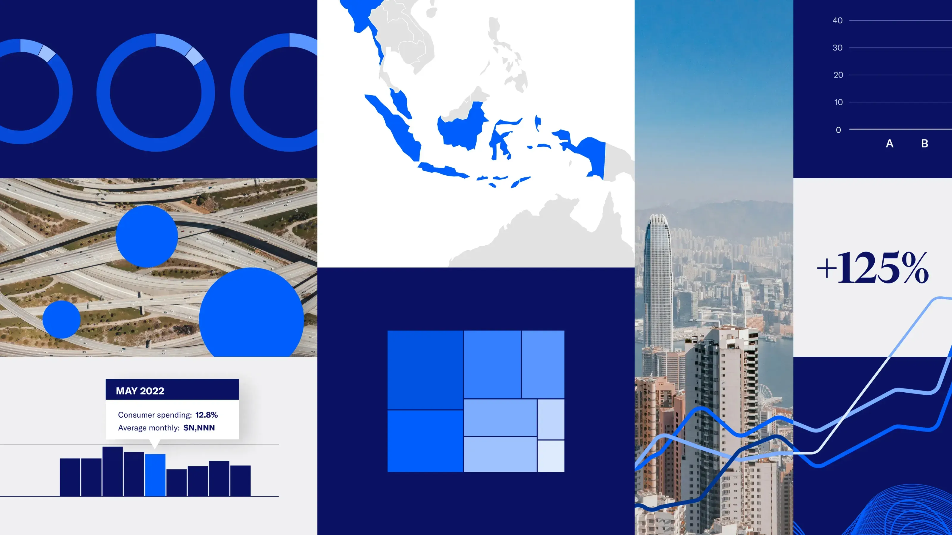
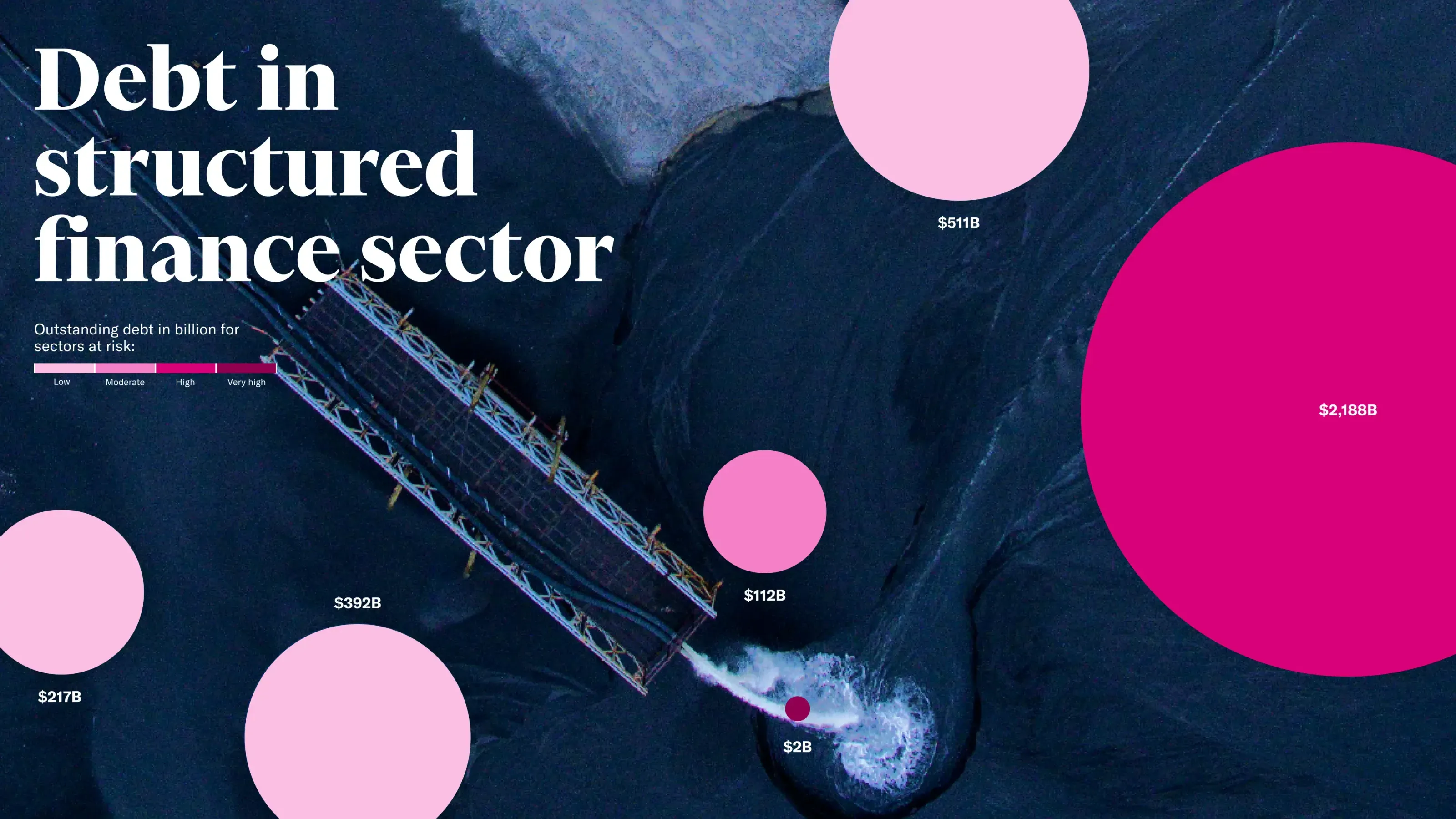
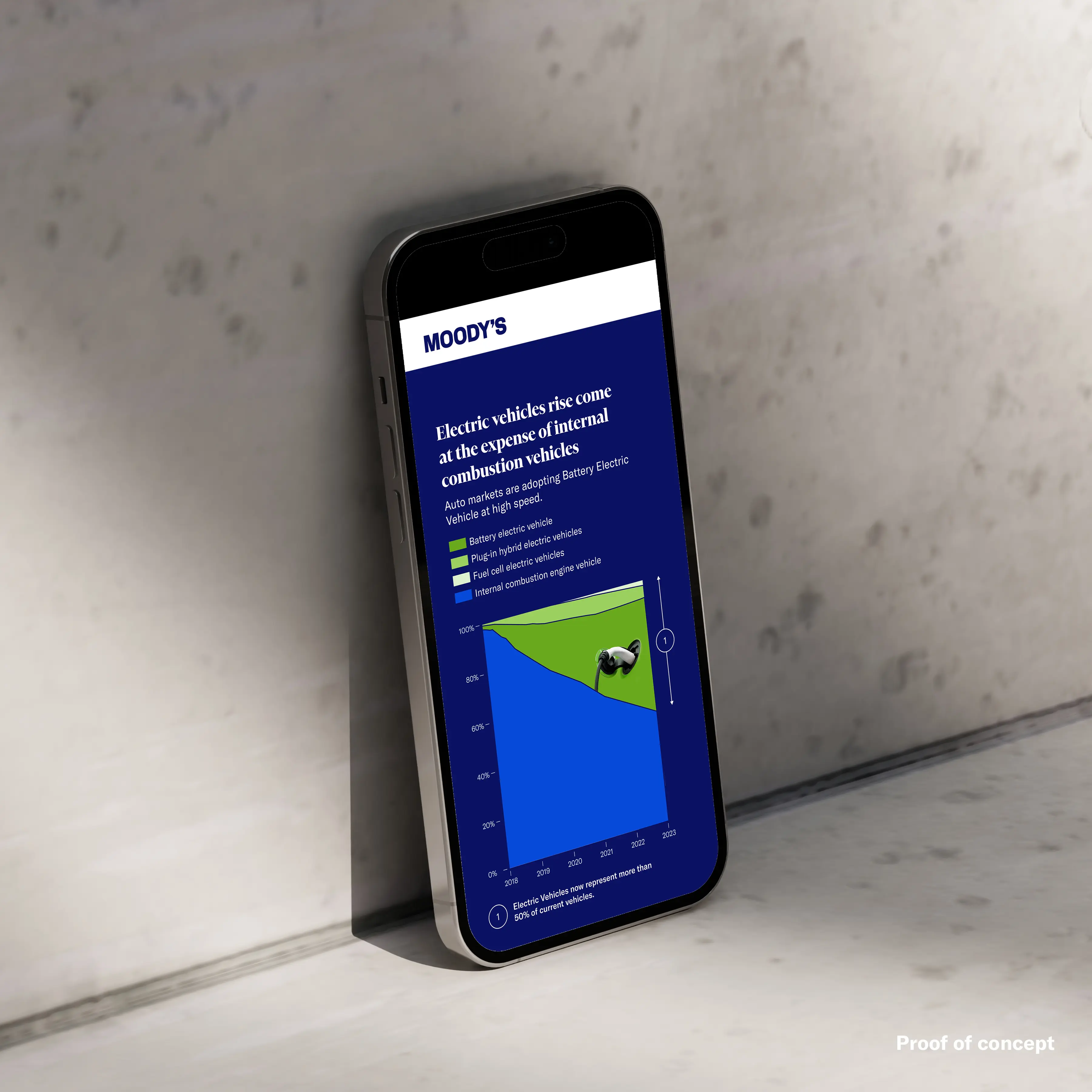
The result was a data visualization design language that complements and propels forward Moody's brand transformation.
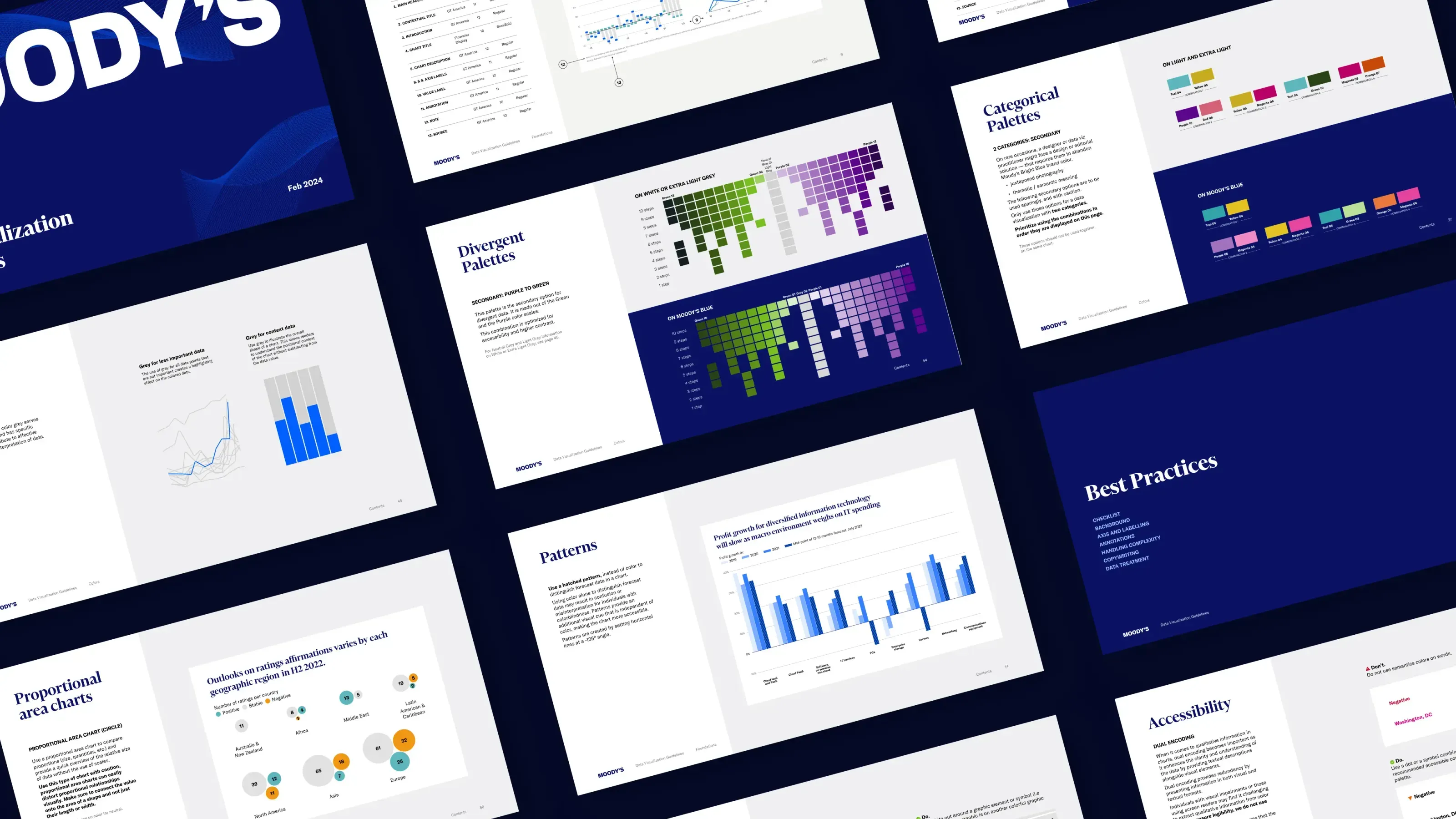
The result was a comprehensive design system embedding Moody's identity into every detail. At its core was a flexible color system with 25+ data visualization palettes, built for the demands of financial risk analysis and optimized for accessibility across two modes. This was brought to life through 15–20 example charts showcasing the system's versatility, and packaged into 89 pages of design recommendations and best practices.
As a junior designer, I supported the creation of both the example charts and the documentation, contributing hands-on to the work that shaped the final guidelines.


Key learnings
A good design system is a design system that is tailored to the specific needs of the design teams.
Investing time setting a solid foundation before scaling up saves time and effort in the long run.
Other projects

