Kharon Resources Page Redesign
From company blog to intelligence hub: A UX and SEO redesign that drove organic growth for Kharon
Impact
Within weeks of launch, compliance articles that with lower rankings for months surfaced on Google's first page. The redesign set a new standard for Kharon's digital experience, with more thoughtful information architecture, a clearer visual hierarchy, and a navigational experience that elevated brand authority and laid the foundation for sustained organic growth.
Why redesign
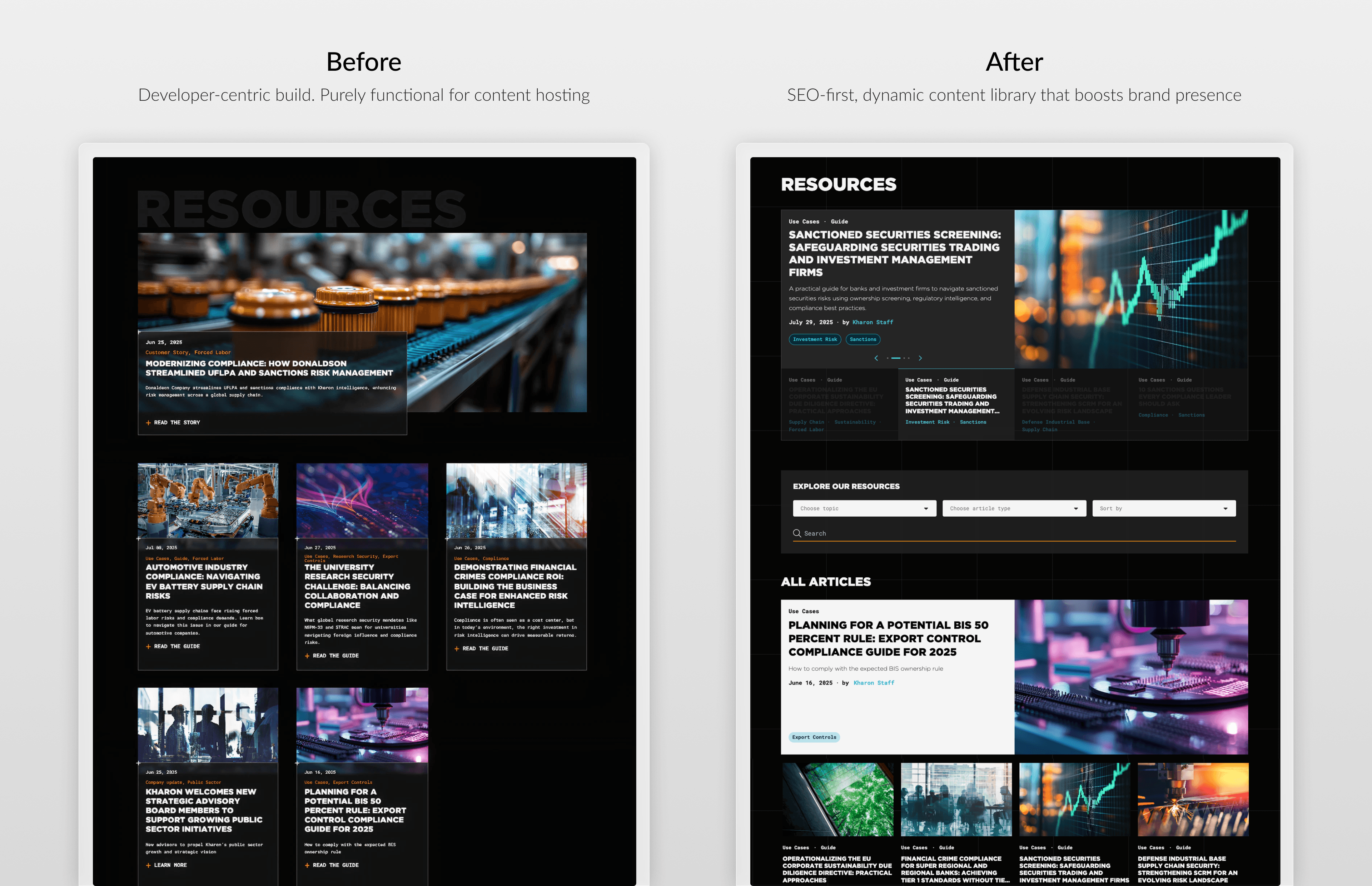
The old design was developer-centric, built around content hosting rather than content discovery. It overlooked user experience, visual hierarchy, and the design thinking fundamentals that signal a premium brand. This resulted in poor organic visibility and a page that undersold the quality of Kharon's compliance intelligence.
Defining the problems
The project brief came as a bulleted list of new features. To properly scope the project and conduct meaningful research, I mapped them to 4 key areas of improvement for this redesign project: topic taxonomy, user flow and experience, visual design, and mobile experience.
Page lacks filtering function. Everything is hidden behind a long scroll.
The overall user flow and user experience is hurting users retention and SEO ranking.
The visual design should enhance skimmability and signal a premium brand with top of industry data and solutions.
The mobile experience is frustrating, with the images being too large and scroll too long.
Challenge
1 designer. 1 developer. 6 weeks. Full stake-holder scrutiny.
With limited resources and a tight deadline, the challenge was delivering a production-ready redesign, with SEO impact, without sacrificing design quality or stakeholder trust.
Limited resources
1 person plays multiple roles. I played the role of PM, and the developer was also a tester.
Pulled in broader team reviews to catch gaps early.
Short timeline
Frequent syncs with developer kept hand-off frictionless.
Phased delivery: core layout first, enhancements second.
Stakeholder visibility
Grounded every decision in competitive market research and SEO data.
Shared annotated mockups with stakeholders at each milestone, not just finals.
Content Architecture
Building a sound foundation for a fast-growing content hub
Content is now classifiable on 2 axes: what it's about (Sanctions, Export Controls, Forced Labor, etc.) and what type of resource it is (Article, Guide, Customer Story). This topic taxonomy and content-type layer powers filtering, internal linking, and URL structure in the long term.
SEO Impact: This creates a cleaner internal linking structure, passing "link equity" more efficiently to deep-layered articles.

User experience & User flow improvement
A discoverable library instead of an endless scroll
A dynamic hero section, topic filtering, search, pagination, and an interactive table of contents work together to create a denser, richer page that gets compliance readers where they need to go, faster.
SEO impact: Faster content discovery lowers bounce rates and increases engagement, which directly boosted Kharon's SEO rankings.


Visual design & branding
Elevating the brand without compromising the experience
The result is a UI that stays on brand, without the visual noise of the previous design. Content is prioritized over imagery, supported by a cleaner and tighter typography system with clear weight distinctions between headers and body text.
SEO Impact: This design allows for high-Contrast "Skimmability", helping users find content quicker.

Responsive Design
Optimizing the mobile experience for a wider audience
With 70% of our visitors on desktop, mobile had been an afterthought. Research into Google's mobile-first indexing made clear this was a significant missed opportunity.
The redesign now transitions seamlessly from widescreen to mobile, improving search rankings, organic traffic, and conversion rates across all devices.


Key learnings and next steps
Time and resource constrains sharpen focus. Every design decision has to earn its place by driving conversion or business value.
Think from an user's perspective. SEO metrics are built around the most optimized user experience.
Other projects

